
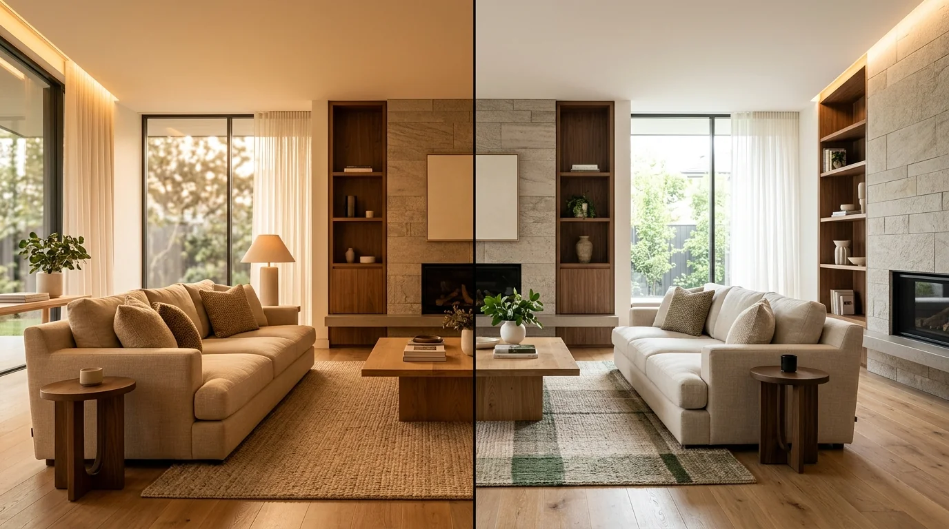
You’ve curated every detail: a tailored linen sofa, textured oak shelving, and walls painted in a soft, welcoming neutral. Yet when dusk settles and you flip on the light switch, something feels slightly off.
Either your pristine white marble looks muddy and yellow, or your relaxing living room suddenly feels clinical and uninviting.
At Stunn Interiors, we find that homeowners often spend thousands on furnishings and paint swatches while overlooking the single element that determines how those materials actually look: color temperature.
In residential lighting, the debate almost always centers on two numbers: 2700K and 3000K. While a 300-Kelvin difference may sound negligible on a spec sheet, it fundamentally alters the atmosphere, emotional warmth, and visual texture of your space.
In this guide, we demystify 2700K vs 3000K interior lighting, explore side-by-side room comparisons, and provide an actionable cheat sheet so you can choose the right bulb temperature with confidence.
What Is the Difference Between 2700K and 3000K Lighting?
The difference between 2700K and 3000K lighting lies in their warmth and color cast. 2700K produces an amber-tinted, golden glow that mimics classic incandescent bulbs for cozy relaxation. In contrast, 3000K emits a crisper, neutral-warm white light that enhances visual clarity, sharpens architectural details, and prevents modern neutral colors from looking dingy.

Understanding the Kelvin Scale in Residential Design
Color temperature is measured on the Kelvin (K) scale, ranging from warm firelight embers to bright blue sky:
- 2000K–2400K: Candlelight / Amber glow (romantic, ultra-warm, low visibility).
- 2700K: “Soft White” (warm, golden, traditional incandescent feel).
- 3000K: “Warm White” (clean, inviting, modern residential standard).
- 3500K–4000K: “Cool White” / Neutral (functional, commercial, task-heavy).
- 5000K+: “Daylight” (blue-tinted, utilitarian, best reserved for garages and utility closets).
The sweet spot for modern residential interiors sits firmly between 2700K and 3000K. Anything above 3500K tends to feel sterile in a home, while anything below 2500K is too dim for functional everyday living.
2700K (Soft White): When to Embrace the Golden Glow
2700K is the direct LED equivalent of the classic 60-watt incandescent bulb. It possesses a noticeable yellow-to-orange undertone that signals relaxation to your brain’s circadian rhythms.
Key Characteristics of 2700K:
- Ambiance: Intimate, nostalgic, soothing, and enveloping.
- Material Interaction: Enhances rich, dark hardwoods (walnut, mahogany), earthy terracotta, warm taupes, and brass hardware.
- Potential Pitfall: Can make bright white walls, modern gray finishes, and marble look dingy, yellowed, or aged.
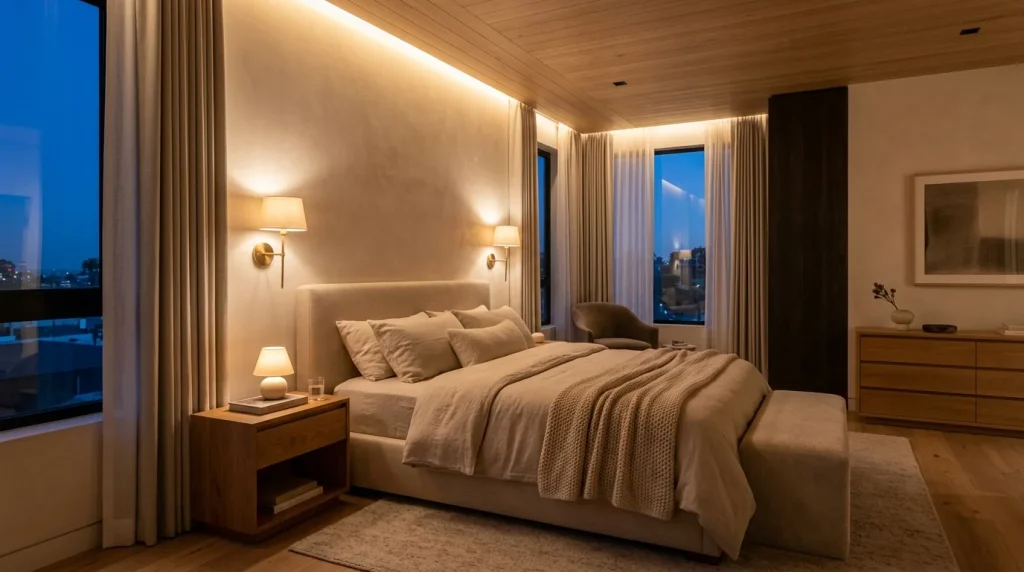
Recommended Rooms for 2700K:
- Bedrooms & Guest Suites: Promotes natural melatonin production and wind-down routines.
- Cozy Living Rooms & Snugs: Ideal for evening conversations, movie nights, and reading corners.
- Dining Rooms: Extremely flattering on human skin tones and makes shared dinners feel warm and celebratory.
- Accent Fixtures & Table Lamps: Perfect for secondary lighting layers when you turn off the main overhead fixtures after sunset.
3000K (Warm White): The Modern Designer’s Sweet Spot
3000K is often described as “clean warm white” or “halogen white.” It eliminates the heavy yellow cast of 2700K while remaining far warm enough to prevent any harsh blue tint.
Key Characteristics of 3000K:
- Ambiance: Crisp, energizing, modern, and visually balanced.
- Material Interaction: Keeps crisp whites white, sharpens polished stone and quartz, highlights architectural lines, and renders colors true to life.
- Potential Pitfall: When used without dimmers in a small bedroom, it can feel slightly too alert for late-night wind-downs.
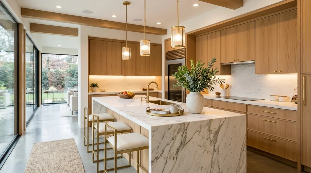
Recommended Rooms for 3000K:
- Kitchens & Islands: Accurately illuminates food prep, clean countertops, and backsplashes without distorting vegetable or meat colors.
- Bathrooms & Vanities: Provides honest reflection for grooming and makeup application without casting an artificial amber filter over your skin.
- Home Offices & Study Zones: Enhances focus, alertness, and page contrast without causing the eyestrain associated with 4000K+ commercial lights.
- Laundry Rooms & Closets: Helps you distinguish navy from black and spot garment stains clearly.
Direct Comparison Matrix: 2700K vs 3000K at a Glance
| Feature / Category | 2700K (Soft White) | 3000K (Warm White) |
|---|---|---|
| Visual Appearance | Warm, golden-yellow, candlelight-adjacent | Crisp, neutral-warm, halogen-like white |
| Mood & Vibe | Cozy, romantic, deeply calming | Fresh, modern, bright, balanced |
| Best Architectural Styles | Traditional, Transitional, Rustic, Mid-Century | Organic Modern, Scandinavian, Contemporary, Japandi |
| Paint Color Pairing | Warm beiges, terracotta, deep greens, creamy off-whites | True whites, greiges, cool grays, crisp blues |
| Wood Tone Complement | Walnut, dark cherry, rich stained oak | Light white oak, bleached ash, maple |
| Ideal Room Applications | Bedrooms, dining rooms, formal living rooms | Kitchens, bathrooms, offices, open-plan spaces |
| Circadian Rhythm Effect | Signals evening relaxation and rest | Encourages gentle alertness without stress |
| Dimming Response | Warms to rich amber (especially with Warm-Dim LEDs) | Dims smoothly while retaining neutral clarity |
How Wall Paint and Materials React to Kelvin Temperatures
Lighting does not exist in a vacuum—it reflects off your surfaces. Pairing the wrong Kelvin temperature with your finishes is the quickest way to ruin an otherwise cohesive design.
1. Warm Paint vs Cool Paint
- If your walls are cool-toned (Pure White, Crisp Gray, Cool Blue): Pair with 3000K. A 2700K bulb will cast a yellow veil over cool paints, turning crisp whites into a muddy cream and making cool grays look greenish.
- If your walls are warm-toned (Warm Cream, Beige, Terracotta, Olive): Pair with 2700K. The amber tones will enrich warm undertones and make the room feel wrapped in warmth.
2. Countertops & Tile
- Carrara & Calacatta Marble: Standard 2700K lighting will give blue-gray veins an unnatural brownish tinge. Opt for 3000K to preserve the stone’s crisp, luxurious veining.
- Warm Butcher Block & Travertine: Radiates under 2700K, amplifying the natural organic beauty of the material.
Stunn Interiors Pro Tip: Don’t Forget CRI (Color Rendering Index)
Color temperature is only half the battle. When purchasing LED bulbs in either 2700K or 3000K, always look for a CRI rating of 90 or higher (CRI 90+). A high CRI bulb ensures that wood grains, fabric weaves, and skin tones render authentically rather than looking dull or greyed out.
Can You Mix 2700K and 3000K in the Same House?
A frequent dilemma we hear from homeowners: “Do I have to commit to one Kelvin rating for my entire home?”
The short answer is no, but you must mix intentionally.
- Never Mix Within the Same Visual Plane: Never place a 2700K recessed downlight right beside a 3000K pendant in the same ceiling zone. The difference will look like an electrical mistake.
- Keep the Ambient Layer Unified: In an open-concept living and dining space, keep all ambient ceiling fixtures at a consistent 3000K (on dimmers) for cohesive architectural flow.
- Use 2700K for Secondary Layers: Introduce 2700K through portable table lamps, floor lamps, and reading sconces. When you turn off the main 3000K overheads in the evening, your secondary 2700K fixtures instantly shift the room into cozy night mode.
- Transition by Room Function: It is completely natural to have 3000K in your kitchen and ensuite bathroom, while having 2700K in your master bedroom and powder room.
Step-by-Step: How to Choose Between 2700K and 3000K for Your Space
- Evaluate Natural Light Exposure: North-facing rooms receive cool, bluish daylight and benefit from the gentle warmth of 3000K to prevent dinginess. South-facing rooms are drenched in warm sun and look stunning with either 2700K or 3000K.
- Audit Your Fixed Finishes: Look at your cabinetry, flooring, and tiles. If light oak and white quartz dominate, lean toward 3000K. If dark walnut and warm brick dominate, choose 2700K.
- Install Dedicated Dimmer Switches: A 3000K LED dimmed to 30% feels substantially warmer and softer than when running at 100% brightness. Dimmers give you day-to-night flexibility.
- Test One Bulb Before Bulk Buying: Purchase a single 2700K and a single 3000K bulb from the same manufacturer. Test them in your space during the day, at sunset, and late at night before refitting the entire home.
Conclusion: Crafting a Balanced, Stunning Lighting Plan
Mastering residential lighting doesn’t require complex calculations or commercial-grade fixtures. It begins with understanding how subtle differences in color temperature shape how you live, feel, and relax in your home.
Remember the “Simple but Stunning” formula:
- Use 3000K where clarity, color accuracy, and freshness matter most (kitchens, bathrooms, and modern open spaces).
- Use 2700K where warmth, connection, and restorative rest take priority (bedrooms, dining rooms, and reading corners).
- Always pair your fixtures with CRI 90+ ratings and smooth dimmer controls.
Ready to take your lighting design further? Explore our complete breakdown on the 3 layers of lighting in interior design and learn how to position your lighting around your room’s main interior design focal point.
Frequently Asked Questions
3000K is best for modern, open-concept living rooms with neutral walls, light oak flooring, or contemporary furniture. However, if your living room is primarily used for evening unwinding, watching TV, and conversation—or features rich, dark wood finishes, 2700K delivers a cozier, more relaxing ambiance.
Neither is inherently brighter; brightness is measured in lumens, not Kelvin. A 2700K bulb and a 3000K bulb with an equal rating of 800 lumens emit the exact same amount of light. However, because 3000K has fewer yellow undertones, human eyes perceive it as crisper, clearer, and visually sharper.
3000K is not too bright if paired with a quality dimmer switch, but 2700K remains the gold standard for bedrooms. The warmer amber tones of 2700K signal your brain to wind down and support restful sleep patterns far better than crisper white light.
In North American packaging standards, 2700K is labeled as “Soft White,” while 3000K is labeled as “Warm White.” In Europe and the UK, both are frequently grouped under “Warm White,” making it vital to check the exact Kelvin number on the box rather than relying on descriptive marketing words alone.
Warm-Dim (or Dim-to-Warm) LEDs are advanced fixtures that automatically drop in color temperature as you dim them—shifting from a crisp 3000K at 100% output down to a glowing 2200K or 1800K candle-like amber at 20% output. This gives you the best of both worlds in open living and dining spaces.